
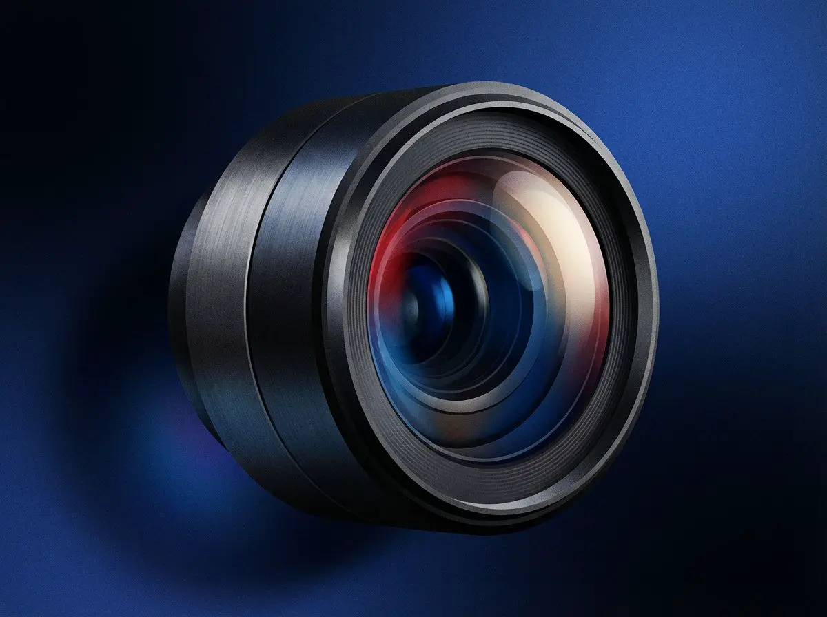
Most luxurious product photography fails the same way: there is too much in the frame. A watch on marble, a sprig of eucalyptus, three softboxes killing every shadow, and somewhere in there, the thing you are selling. It looks like a hotel gift shop. My position, after enough of these shoots: luxury reads as restraint, and the brands that style hardest are the ones least sure of the product. You can disagree. What follows is the case.
The prop pile is a confidence problem
Props answer a question the product cannot answer alone. Scale, usually — travel candle or dinner-table one. Sometimes material: leather against stone reads differently than leather against a white sweep.
What happens instead is that props multiply. Eucalyptus, because the reference board had eucalyptus. A marble slab, because marble photographs well. A ribbon, because the box ships with one. By the fourth object the frame is about a mood, not a product, and mood is the cheapest thing in visual merchandising.
The test: strip every prop out, shoot it clean, then add back only the objects whose absence you can actually see. Usually that is one. Often zero. Four is a decorating project.
Hard light, and the softbox habit
The standard advice is soft, diffused, even light, which is a large part of why the category looks identical. A big modifier close to the product wraps light around every edge and kills the shadow. What comes back is legible and weightless. Soft light is the safe default because it hides mistakes, and that is exactly what is wrong with it.
Hard light does the opposite. Move the source further back, or make it smaller relative to the product, and the shadow gets an edge you can point at — the object starts to look like it has mass and sits on a surface rather than floating in a white void. Watches, fragrance and spirits have been shot this way for decades: one directional source, a shadow you could measure, one side left to fall away into darkness. Nobody fills that side. The darkness is the point.
There is a cost. Hard light is an honesty test: it shows the seam that does not quite line up, the fingerprint on a polished case, the place where the finish was rushed — which is why brands with something to hide reach for the biggest diffuser they own. If the product survives it, shoot it that way. If not, the lighting is not what needs fixing.
Chrome and glass complicate this. Polished surfaces reflect the room more than the light, so the job is controlling what the surface sees. Composition follows the same rule: centre it, shoot square on, stop hunting for a diagonal.
Empty space is the most expensive thing in the frame
Every brand says it wants a clean background. Then the product gets cropped to fill the frame, because somebody pointed out it has to be visible on mobile.
Mass-market catalogues crop tight and they are right to. Luxury inverts that, and the waste is the message: this object is worth a whole frame of nothing.
Background follows. Marble, velvet and silk get recommended constantly here, and all three are usually wrong: their texture competes at the same scale as the product. A plain sweep with a gradient falling away behind the object does more. Our white background guide covers keeping that fall-off even.
Consistency compounds. One restrained image is a nice photo. Forty of them, same shadow angle, same crop ratio, read as a brand.
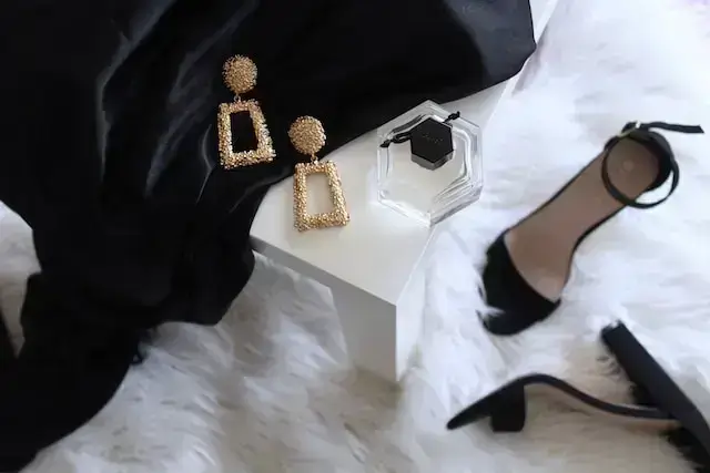
Source: Gabrielle Henderson
Where luxurious product photography is worth real money
Not the camera body. Almost anything current will out-resolve what your site actually serves.
Spend on subtraction instead: flags, black card, scrims, a light you can place precisely. Then surfaces — one matte sweep, replaced the moment it creases. Then retouching hours, because a hard source produces files needing cleanup a soft-lit frame would have hidden.
If you are generating variations in ProductAI rather than reshooting, the same discipline applies to the prompt. Generative tools default to maximalism and will put the eucalyptus back. Our notes on AI product photography tools cover where those seams show.
Templates for this look
Open each one in the studio with your own product — the prompt and lighting are already set up.
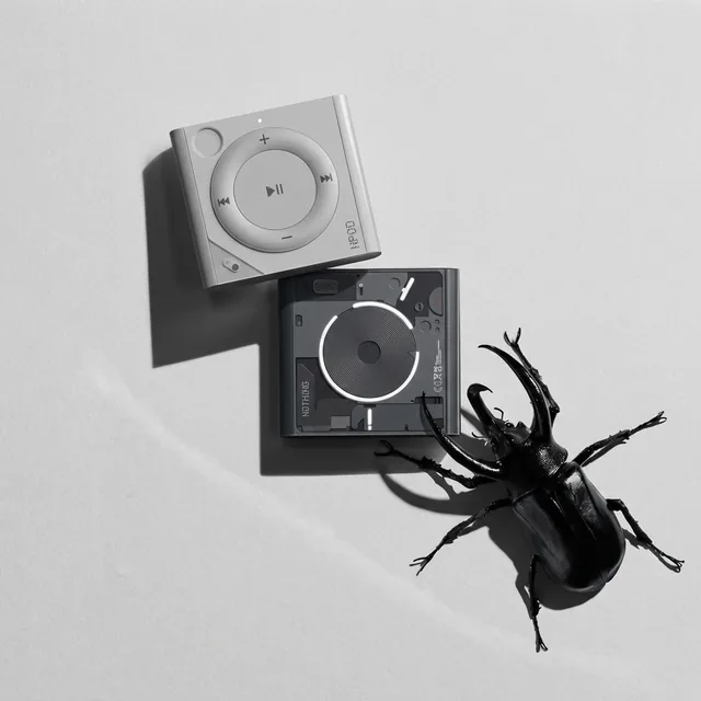 Hard shadow, grey sweepOpen in studio →
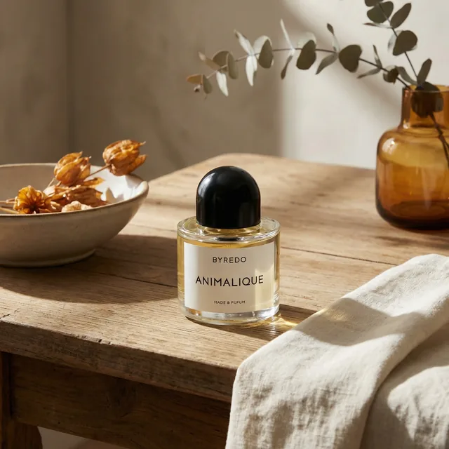 One prop, warm minimalOpen in studio →
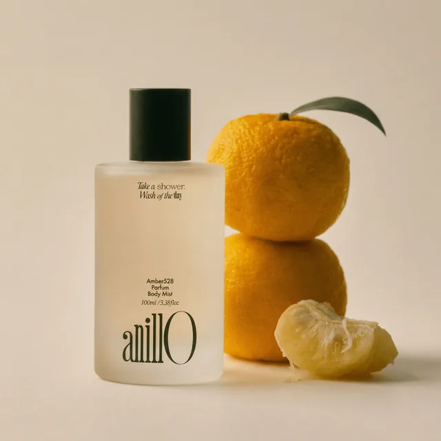 Sculptural, soft neutralOpen in studio →
Where this argument breaks
Restraint only holds if the product can carry an empty frame. Craft-heavy things — hand-thrown ceramics, woven textiles, anything whose appeal is in the making — need context to be legible, and stripping it out reads as cold rather than expensive. The test: does the empty space look deliberate, or like a prop went missing? Shoot both and see.