
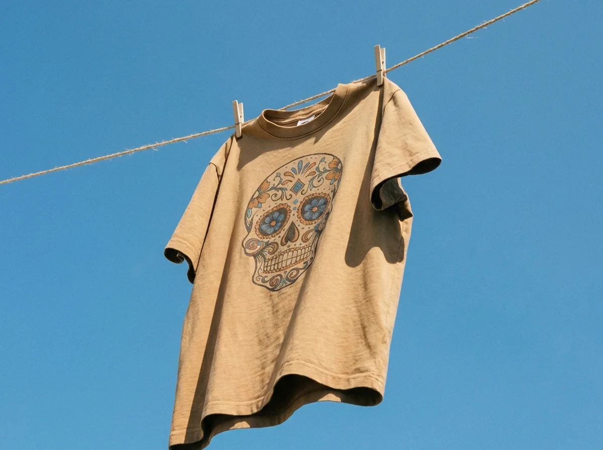
Most clothes photoshoot ideas fall apart at the second SKU. The first shot looks great. Then the light shifts, the crop drifts, someone folds the next jumper differently, and by product forty the grid looks like four different shops trading under one name. Flat lay clothing photography holds up better than any other apparel format for exactly one reason: everything that makes it good is repeatable. Fixed camera height, fixed surface, fixed distance from the window. Below are eight flat lay setups worth building a shoot around, what each one is actually for, and the two that deserve more of your time than the rest.
Short on time? AI clothing photography keeps every SKU in the same look by generating on-model and hanger shots from one garment photo.
What a flat lay actually is
Garment on a flat surface, camera directly overhead, shot straight down. That is it. No model, no mannequin, no stand. It works with a phone, needs about a square metre of floor, and produces frames that stack cleanly in a product grid — which is why it remains the default for tees, knitwear, denim, kidswear and anything else that folds.
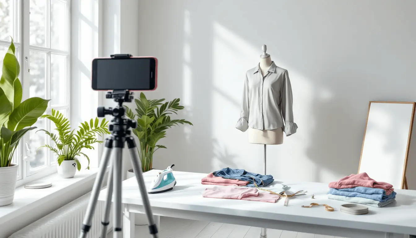
8 Flat Lay Clothes Photoshoot Ideas (That Look Premium and Sell)
Mix two or three per SKU. Numbers one and four are where I would spend the real time; the other six are fifteen-minute setups once the surface is taped down.
1) The clean catalogue flat lay
One garment, centred, nothing else in the frame. Boring on purpose.
This is the shot that carries the product grid, and the only thing that matters about it is that number thirty looks identical to number one. So build the set before you photograph anything. Lay the surface down, put the camera on a tripod or a boom arm, get it genuinely square to the floor rather than approximately square, then tape two small marks where the shoulders sit. Those marks are the whole trick. Every garment goes on the marks, the camera never moves, and the crop is the same for all thirty.
Then work one pass per stage instead of one pass per garment: steam everything, lint-roll everything, shoot everything, edit everything. Batching by stage rather than by SKU is what turns a full day into an afternoon, because you stop picking the steamer up and putting it down thirty separate times. If your marketplace insists on pure white, do the cutouts in one pass too — removing backgrounds in a batch keeps the edges consistent in a way that image-by-image editing never quite does.
Two rules worth more than any gear upgrade: never move the light mid-batch, and put a colour card in the first frame so the whole set can be corrected to the same white afterwards.
Best for: product grids, marketplace main images.
2) The styled outfit
Top, bottom, shoes, one accessory, arranged as a complete look. It answers what do I wear this with, which is the question that quietly stalls a cart on anything unusual. Keep the hero item dominant. If the shoes are more interesting than the jacket, shoot it again.
Best for: collection pages, social, anything with a styling problem.
3) The folded retail stack
Fold the item the way a shop floor would, then stack two or three. Thickness reads instantly, and that matters most for knitwear, where the photo has to do the job a shopper's hands would do in store. Use the same fold on every SKU or the stack looks careless.
Best for: sweaters, denim, basics, bundles.
4) The detail story: weave, seam, label
A hero flat lay plus one or two close-ups of the parts a buyer would reach out and touch.
Take a linen shirt sitting at the top of your price range. The overhead hero shows a shirt. So does the cheap shirt three rows down in the same grid, because at thumbnail size linen and polyester are the same beige rectangle. Nothing in that frame explains the gap in price. The close-up is where the price gets argued: the weave at roughly actual size, the shell button, the flat-felled seam, a woven label instead of a printed tag.
Shoot these on the same surface and in the same light, immediately after the hero, while the set is still standing. Move the camera down rather than cropping in later — a crop taken out of a full-garment frame does not hold enough resolution for texture, and texture is the entire point of the shot. One thing that took me too long to work out: light the close-up slightly from the side rather than flat from above. A little rake across the fabric is what makes weave visible at all. Frontal overhead light flattens it into nothing.
Best for: anything above your average order value, natural fabrics, craft or heritage positioning.
5) The colour-variant grid
The same garment in every colourway, laid out at identical orientation and spacing. One image does the work of six thumbnails and stops people bouncing off the page to find out whether you stock the black one. Spacing has to be even; the eye catches a two-centimetre error immediately.
Best for: tees, hoodies, socks, basics.
6) The unboxing layout
Everything that arrives in the parcel: garment, tissue, tags, care card, whatever else you include. Cheap to shoot and disproportionately useful, because it sets expectations before the purchase rather than after — which is where most disappointed reviews come from.
Best for: gift sets, subscriptions, brands charging for the unboxing.
7) The seasonal prop shot
One prop family, no more. Autumn leaves or holiday ribbon, never both, and never a scattering of unrelated objects around the edge of the frame to fill space. Props date fast, so keep them out of the images that have to sit on the product page all year.
Best for: campaigns, email banners, promo slots.
8) The negative-space frame
Push the garment off-centre and leave a third of the frame deliberately empty for copy. Your designer will use these constantly, and without them will end up faking the space with a badly cloned background. Check the garment still reads at thumbnail size once the text lands on top of it.
Best for: paid social, hero banners, landing pages.
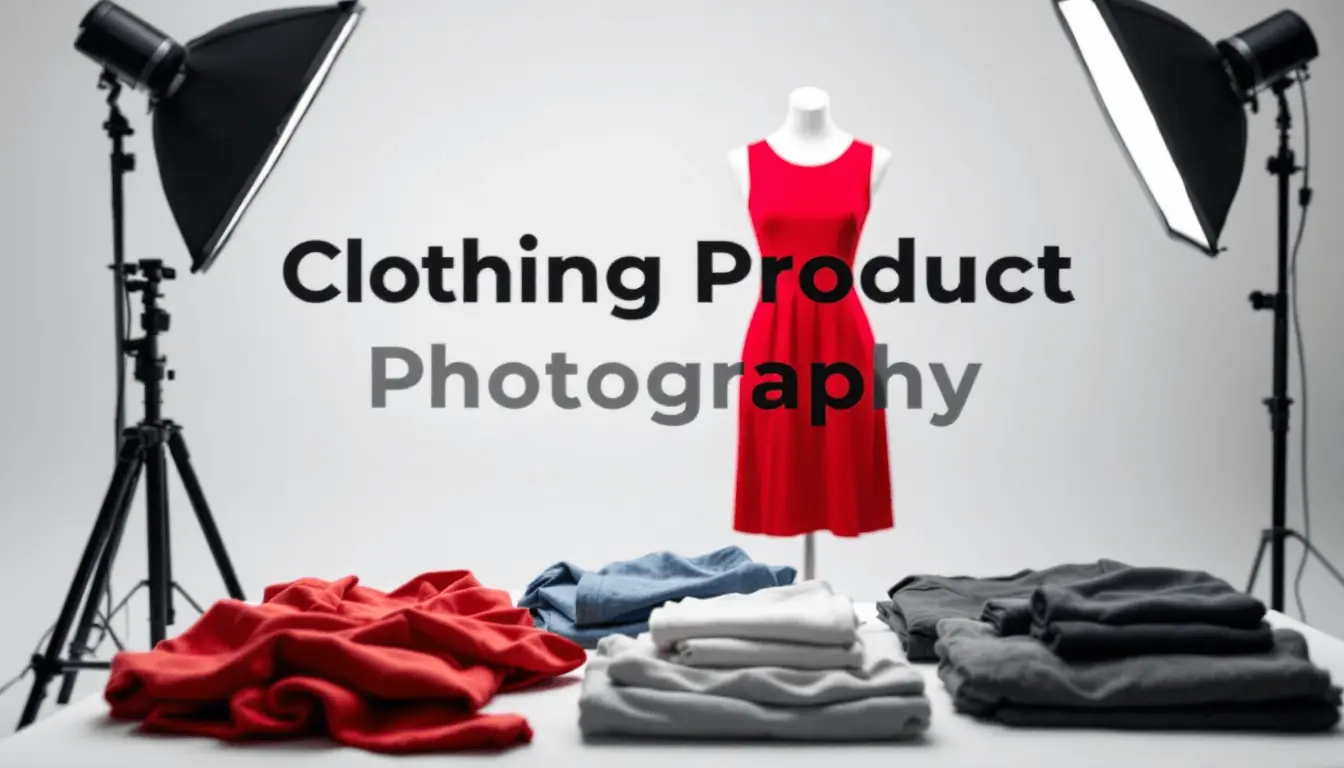
The kit, and the order to buy it in
A phone, a tripod that can point straight down, a white foam board, a window. That covers most of it.
The order matters more than the list. Buy the overhead mount first, because an inconsistent camera angle is the flaw people notice without being able to name it. A steamer next — wrinkles cost more sales than resolution does. Then a colour card, once you have enough SKUs that colour drift between batches turns into a returns problem. A softbox comes last and is genuinely optional; north-facing window light with a white board opposite is very good and free.
Skip ring lights, which lay a doughnut of highlight across anything with a sheen. And avoid mixed lighting of any kind: a window plus a warm ceiling bulb gives you two colour temperatures in one frame, and no amount of editing fixes that cleanly. Turn the room lights off.
Templates for this look
Open each one in the studio with your own product — the prompt and lighting are already set up.
 Clothesline, hard daylightOpen in studio →
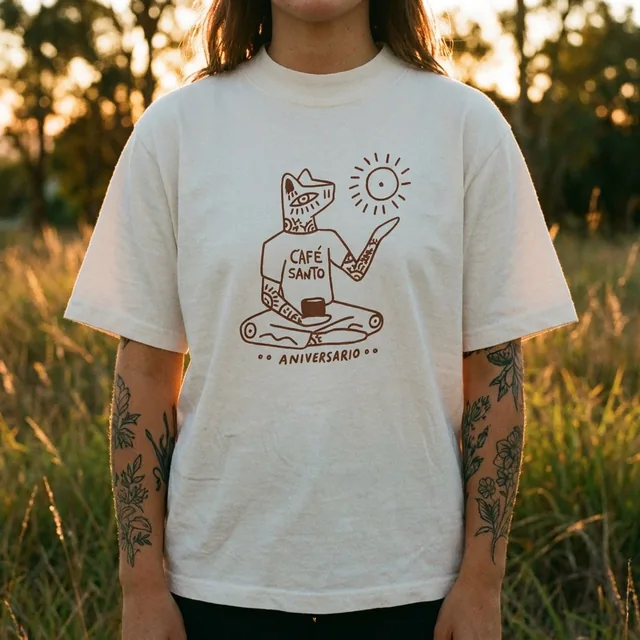 Golden hour, outdoorsOpen in studio →
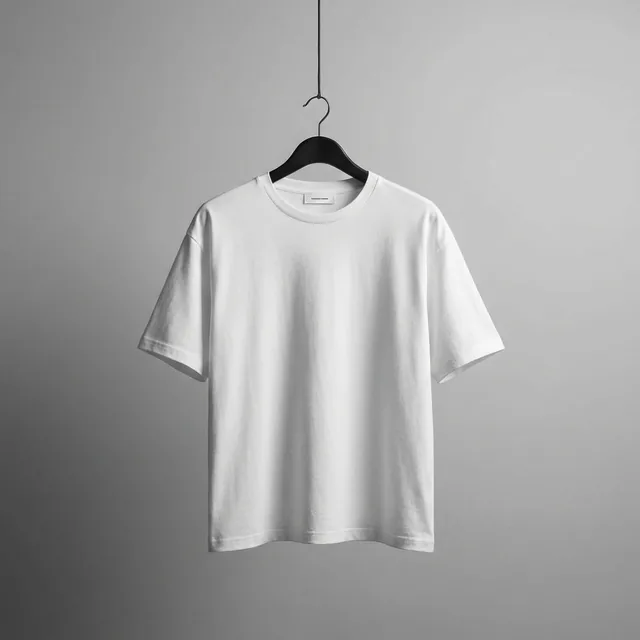 Hanger on seamlessOpen in studio →
Which of these you need depends on where the image lands
A Shopify product page wants four: clean hero, styled outfit, one detail, and either a variant grid or the unboxing layout. That is the stack. More images rarely help, and every extra one is another thing you have to match again next season.
Resale platforms want the opposite of polish. Depop and Poshmark buyers are assessing condition, so photograph the flaw — the pill on the cuff, the faded label — rather than styling around it. More on that in how to take photos of clothes to sell.
Paid social runs on the negative-space frames and the styled outfits, cropped to 4:5 and 9:16 before anyone asks. Export those at shoot time, not two weeks later when the campaign is already late; the Shopify image size guide has the dimensions.
Large catalogues need the least creativity and the most discipline. One background, one light setup, one crop rule, locked for the season. For a worn-on-body look without booking a model, the ghost mannequin effect shoots on the same set.
Flat lays have one honest limitation: they cannot show drape. A jersey dress laid flat tells you the colour and nothing at all about how it hangs, so anything cut on the bias needs a body under it eventually — clothing product photography covers when that cost is justified. Where flat lays do work, ProductAI can generate the background variants and channel crops from frames you already shot. Start with idea one and get thirty SKUs through it.